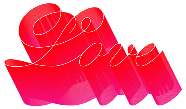
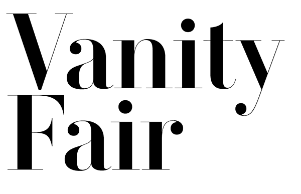
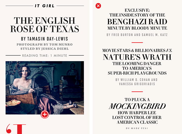
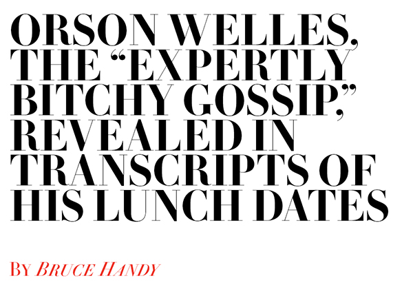
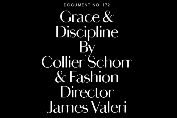
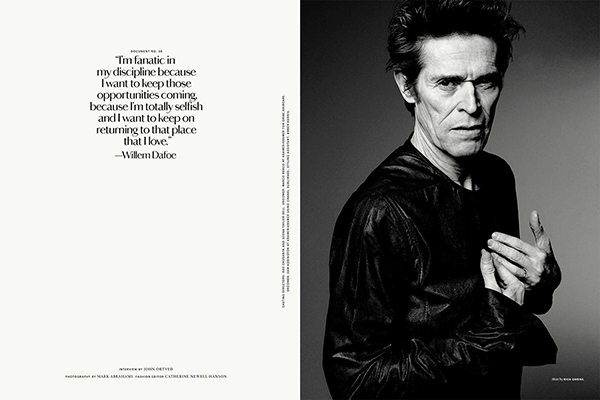
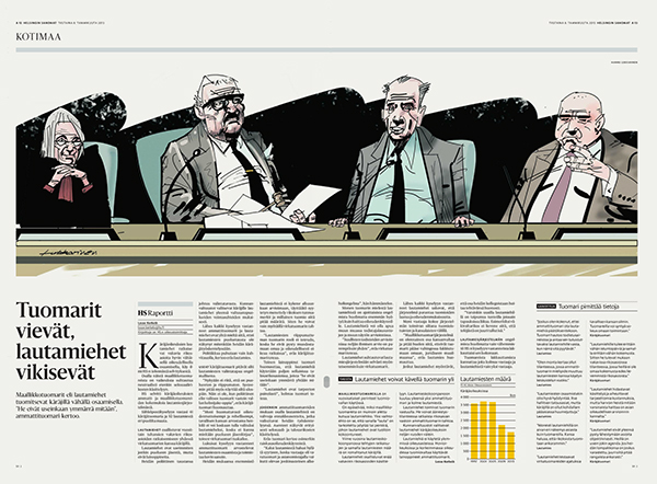
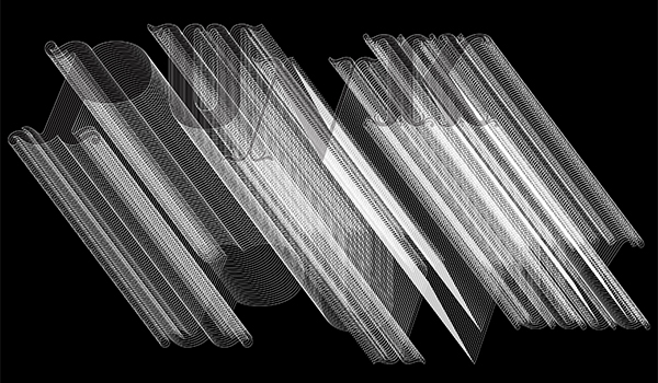
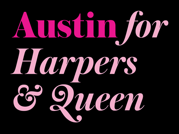
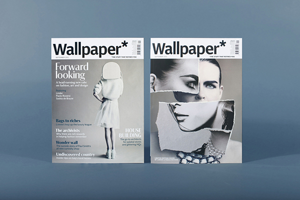
Paul Barnes is a unique breed of graphic designer specializing in typography, type design, lettering and editorial design. Currently based in London, he is a partner alongside Christian Schwartz in the internationally acclaimed typefoundry, Commercial Type. While working in New York in the early 90s he was involved in the redesigns of Newsweek, US, British Esquire and Foreign Affairs. During the same period he art directed Esquire Gentleman and U&lc, and later went on to art direct Spin. He has also served as advisor and consultant on numerous publications, notably Wallpaper*, Harper’s Bazaar and frieze.
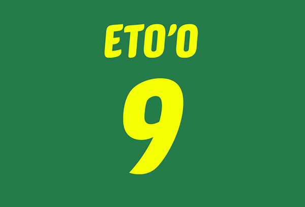
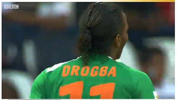
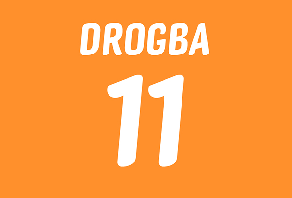
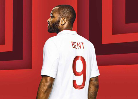
Barnes also enjoys a long term creative partnership with Peter Saville, having worked with Saville to create identities for Kate Moss, Givenchy, ‘Original Modern’ for Manchester as well as several music-based projects for bands such as New Order, Joy Division, Gay Dad and Björk. He has designed typefaces for the National Trust in England, the numbers for Puma at the 2010 World Cup and most recently the numbers for the England football team for Umbro.
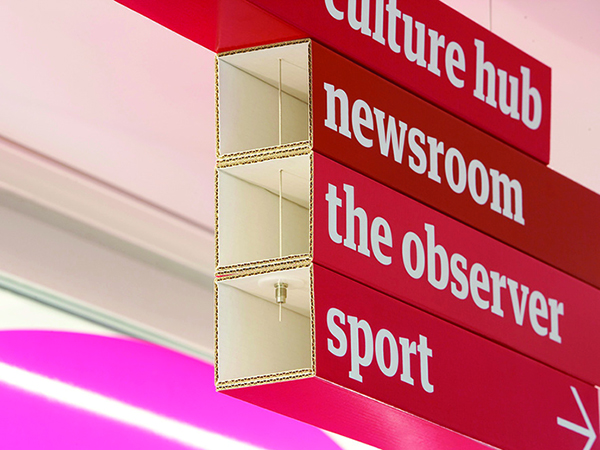
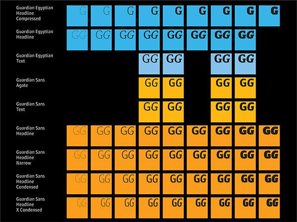
One of Barnes most notable and widely recognised projects is the 2005 redesign of the Guardian, his first collaboration with Schwartz, for which they designed the Guardian Egyptian typeface family under the direction Mark Porter—the Guardian’s creative director at that time.
Following the Guardian redesign, the team was awarded D&AD’s much coveted Black Pencil and nominated for the Design Museum ‘Designer of the Year’ award. In September 2006 Barnes and Schwartz were named in Wallpaper*’s ’40 most influential designers under 40’. The Guardian also named Barnes as one of the 50 best designers in Britain.
www.commercialtype.com
www.moderntypography.com
Comments are closed